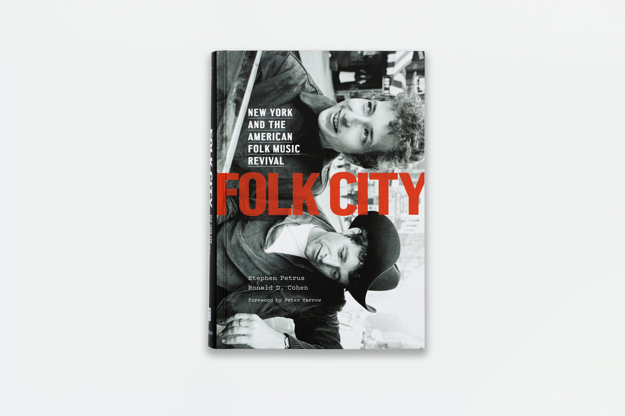
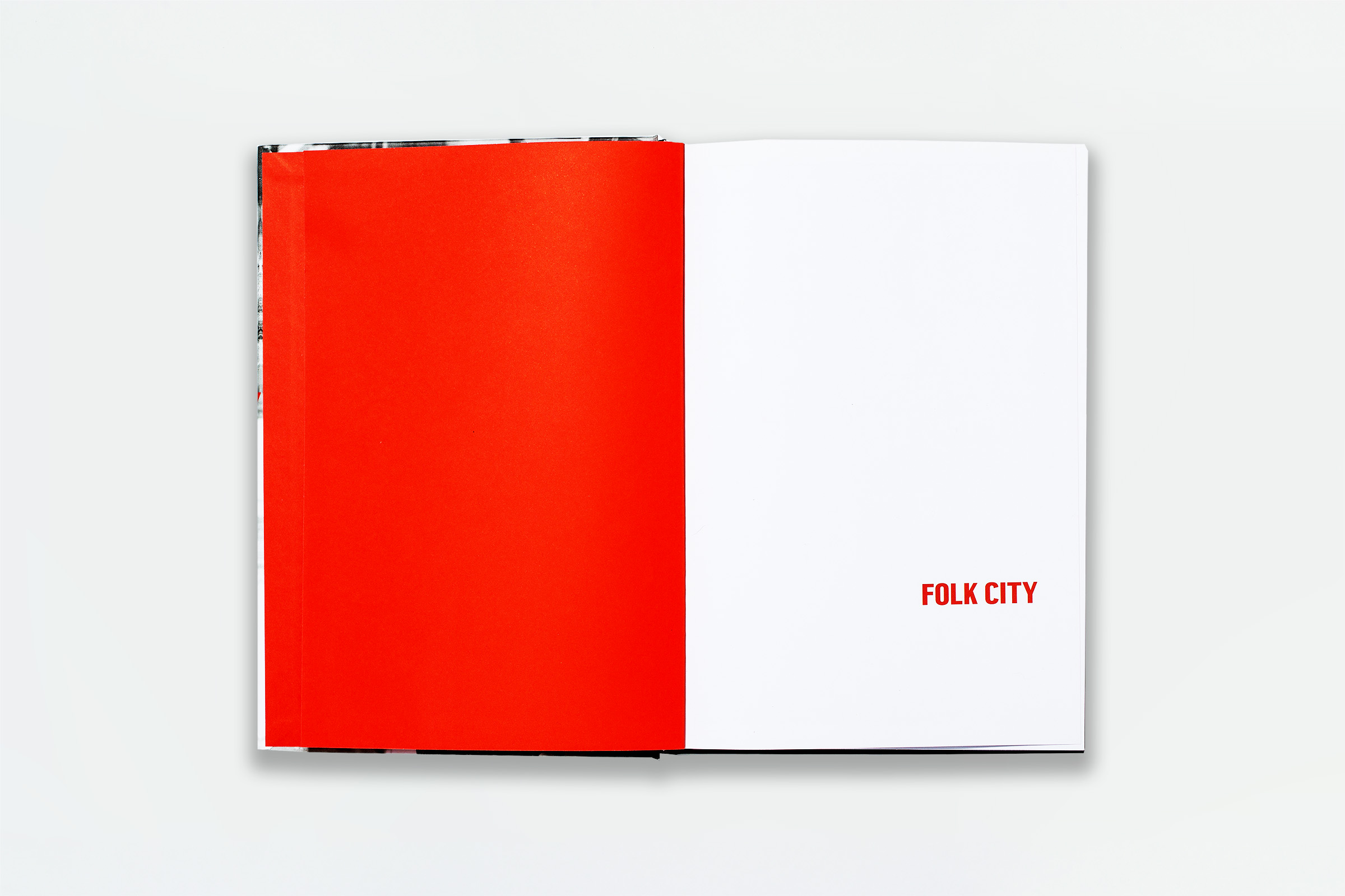
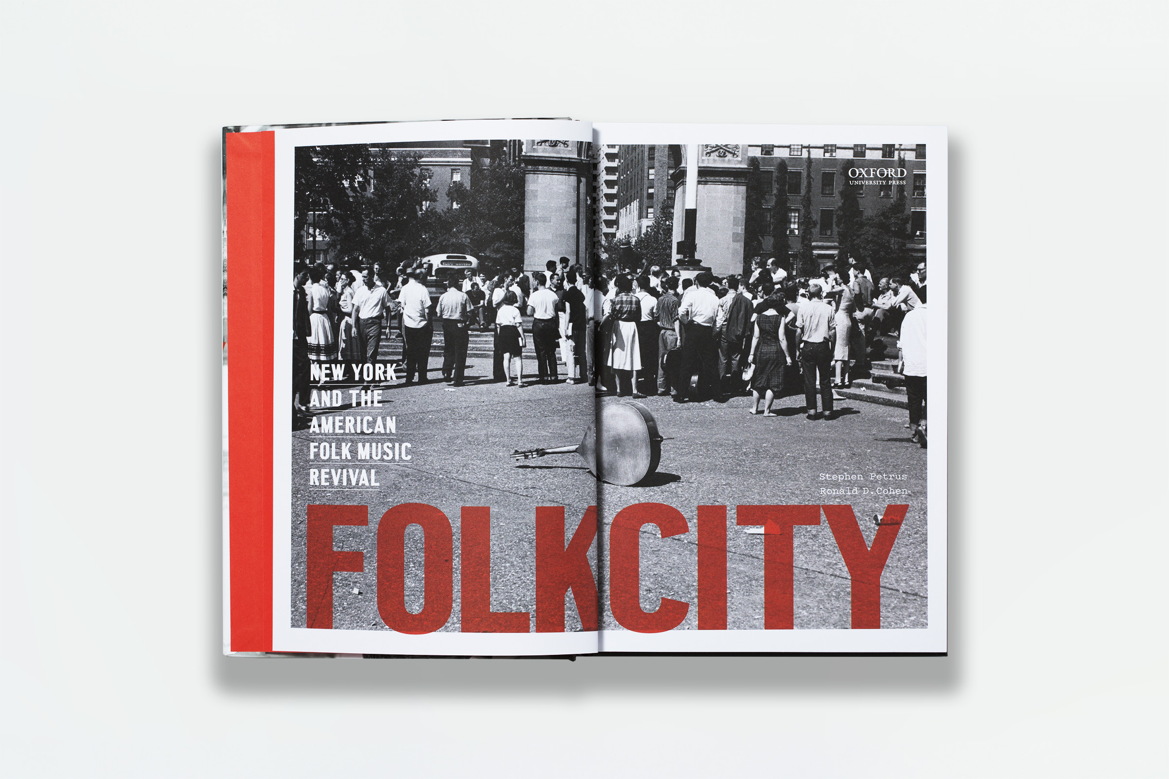
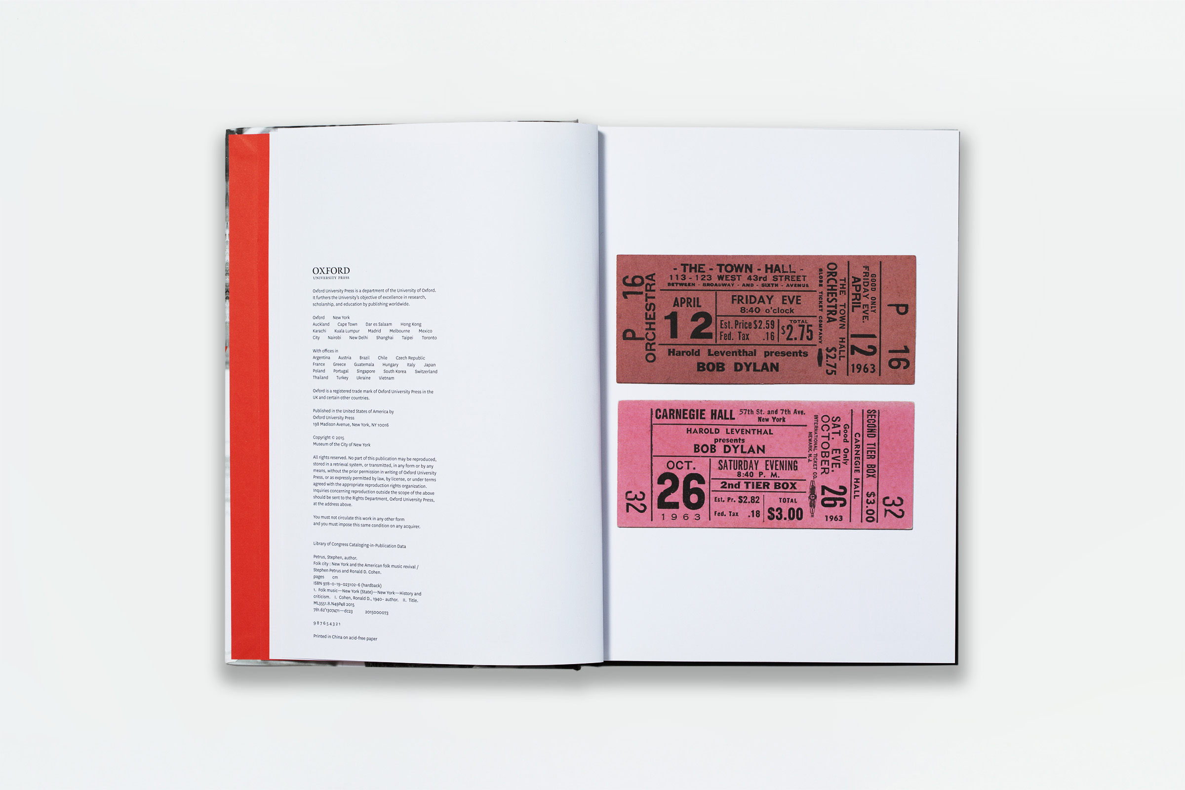
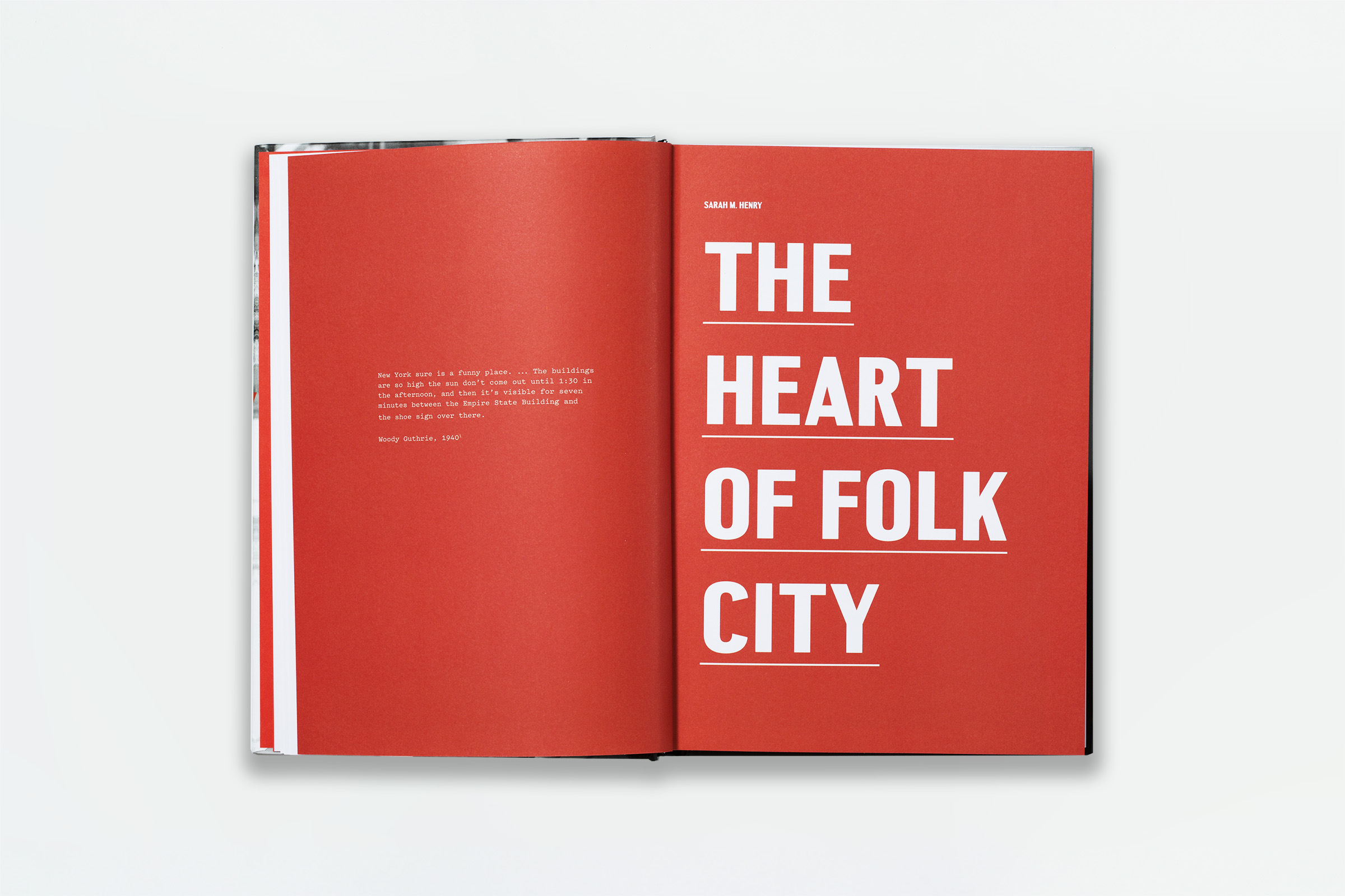
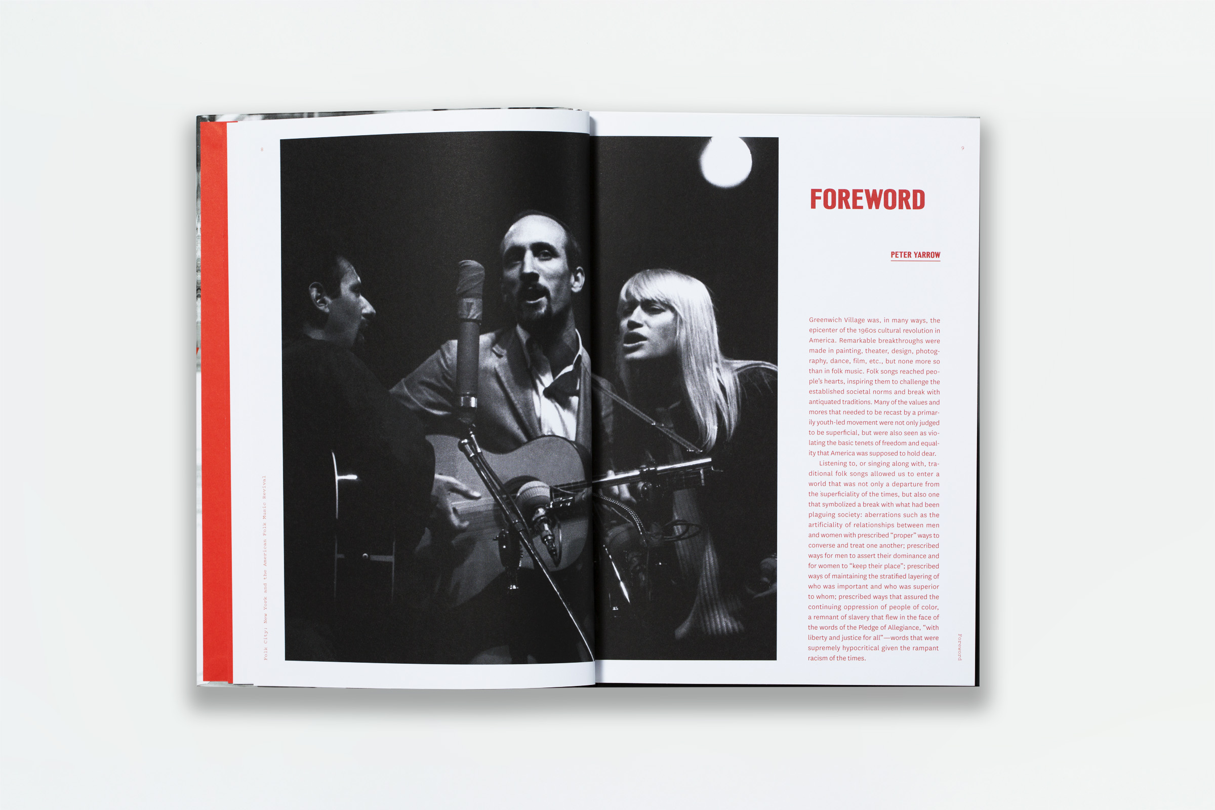
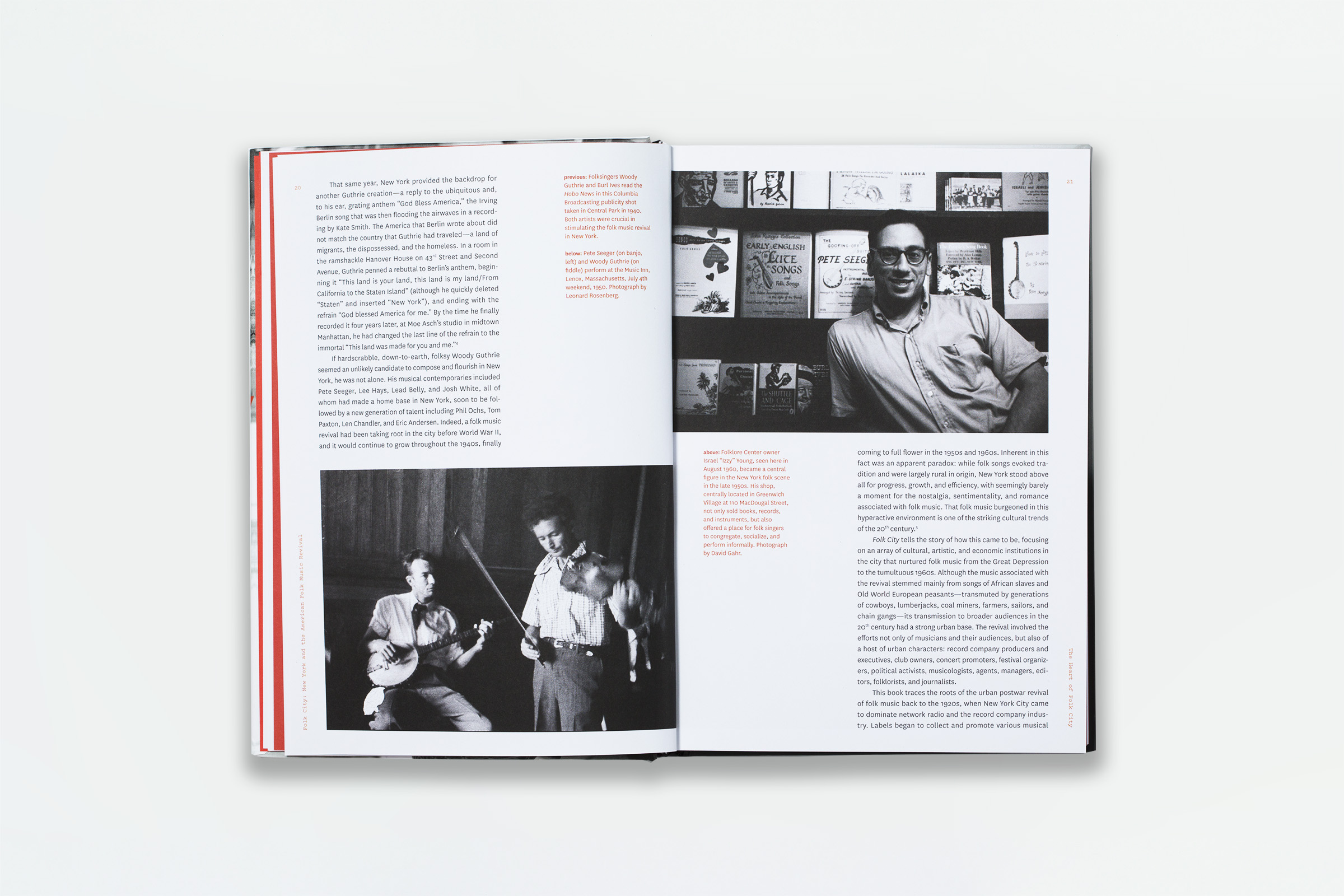
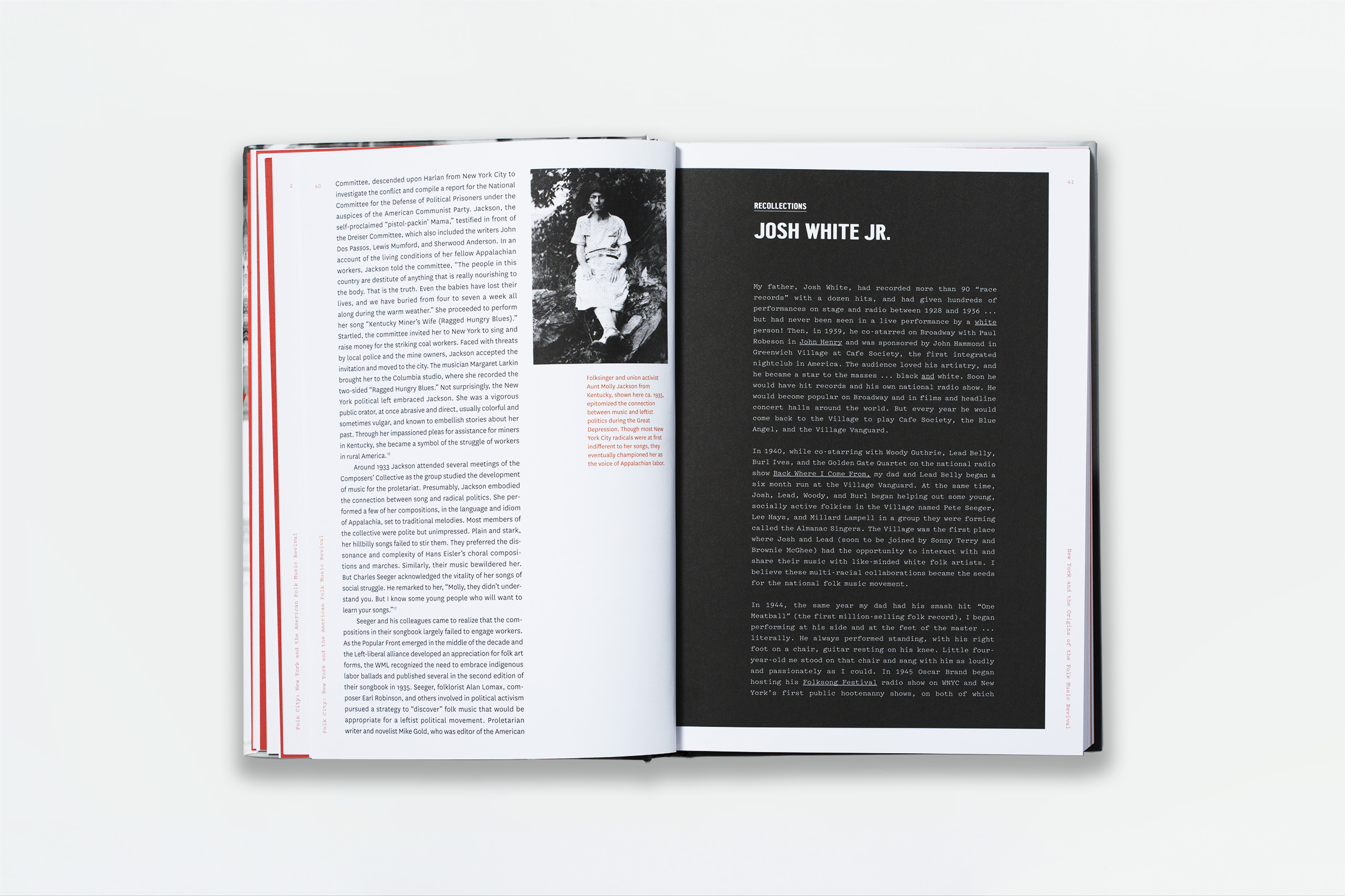
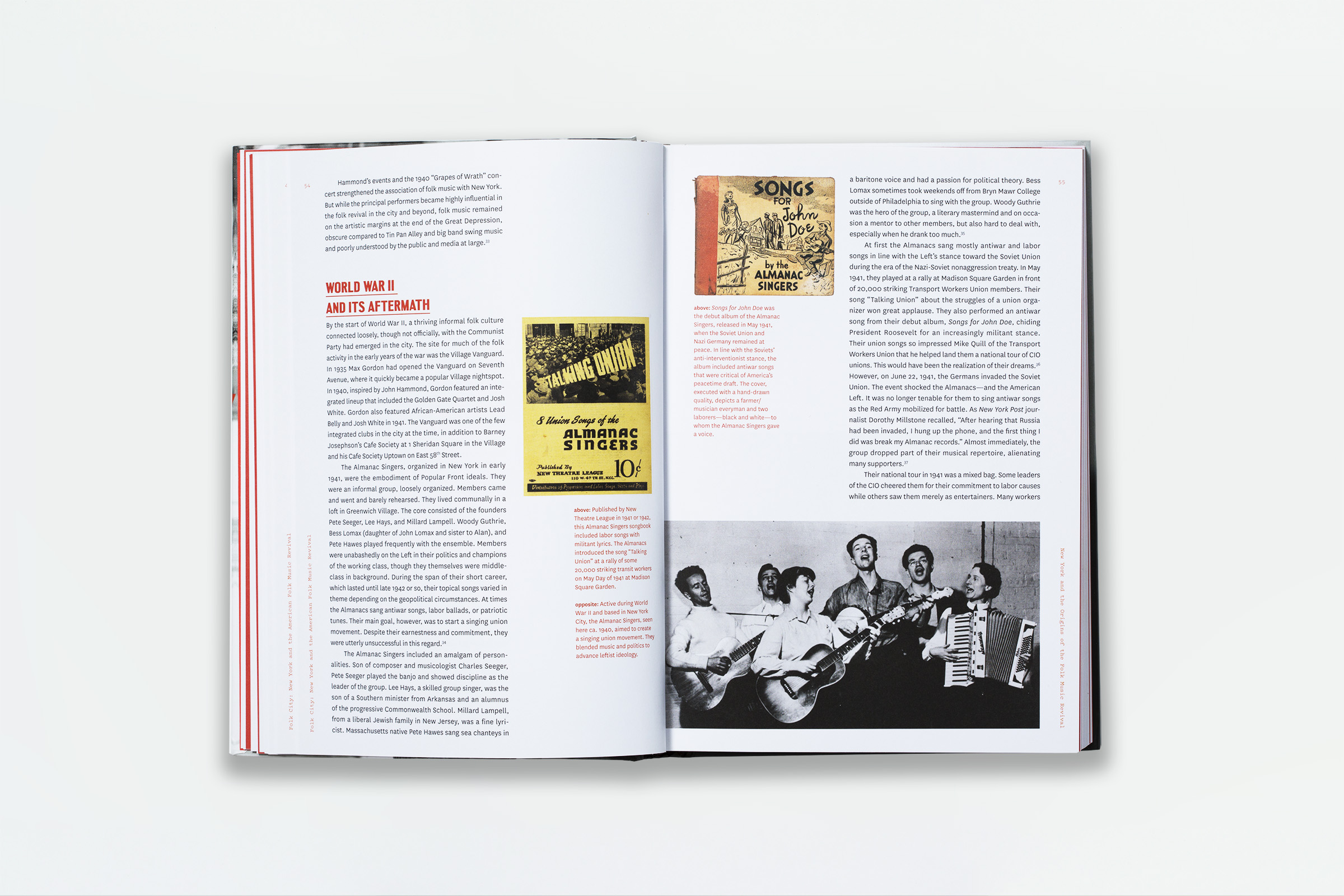
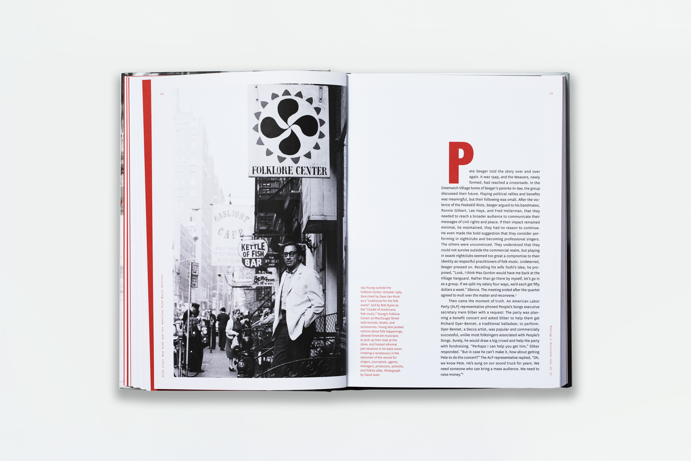
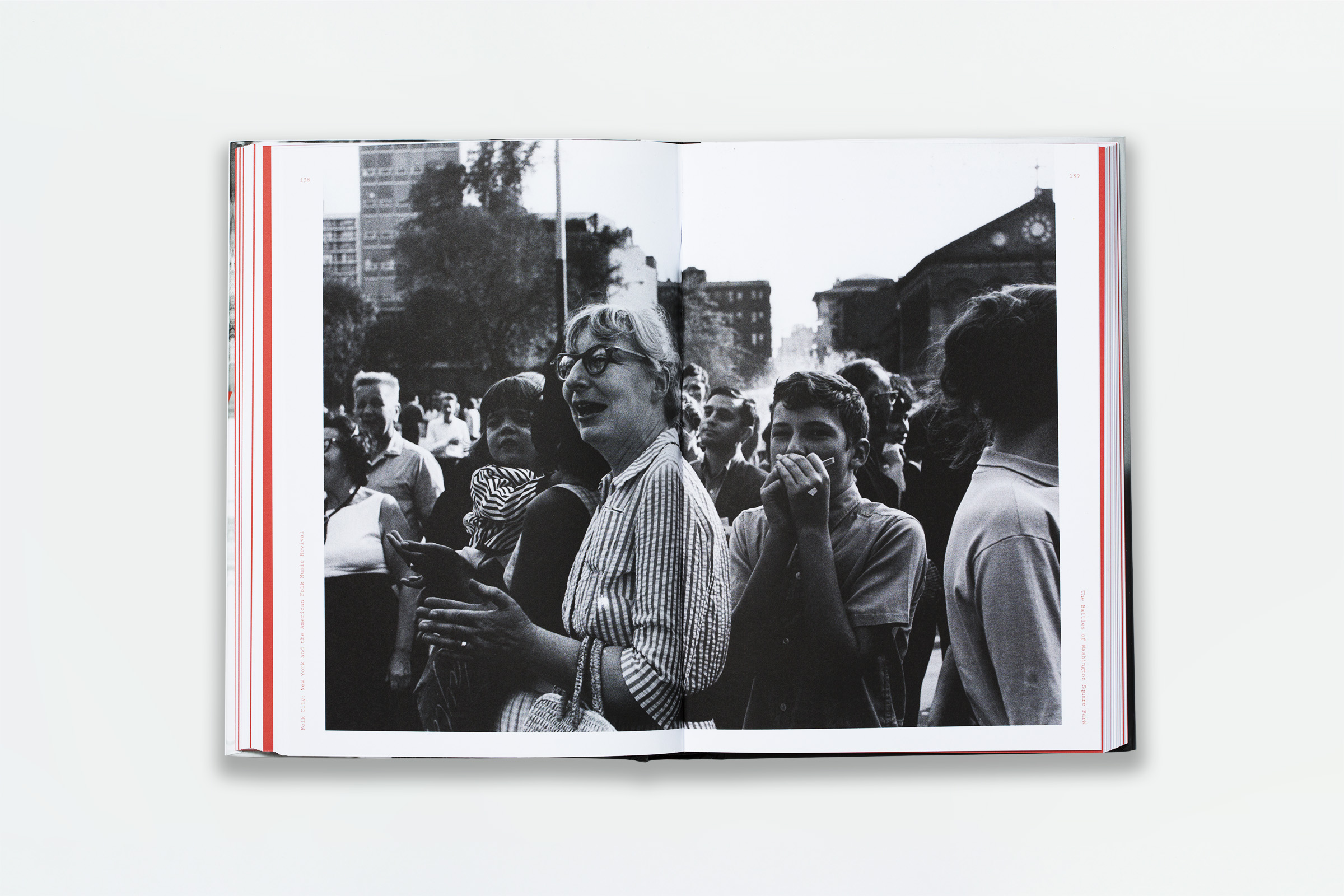
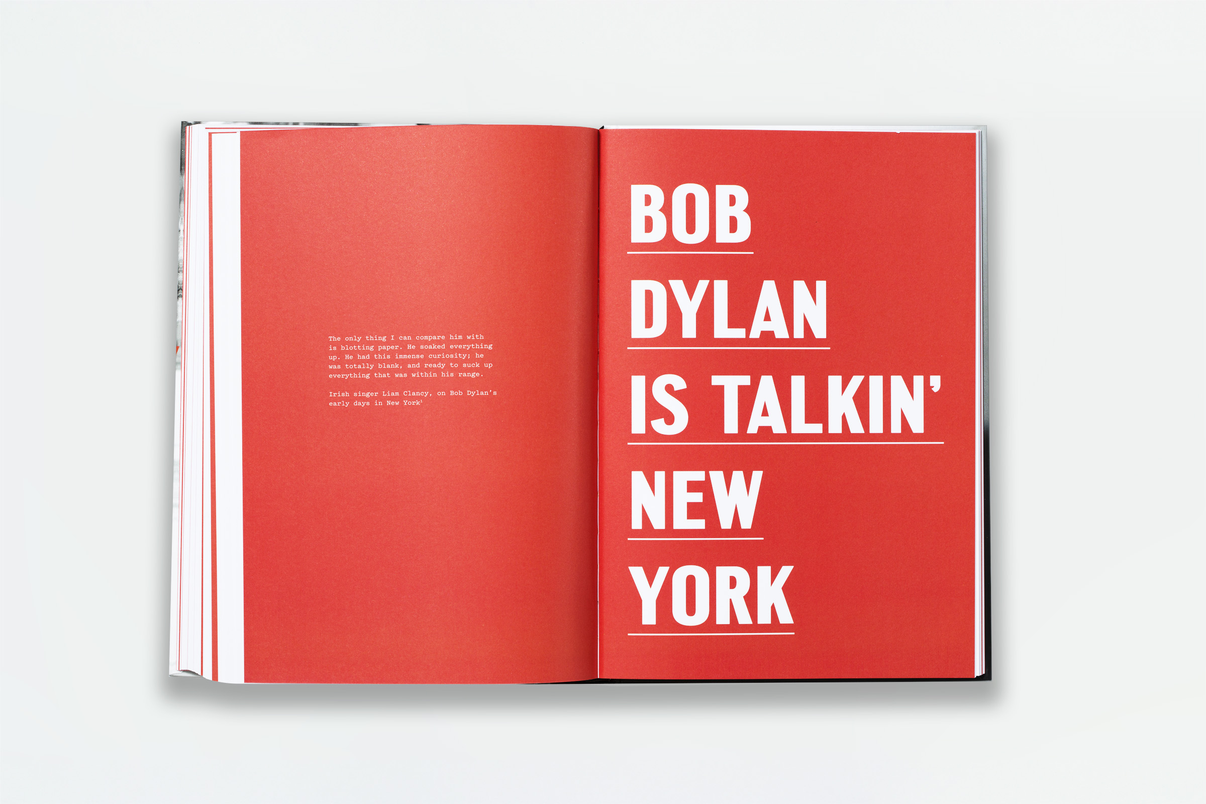
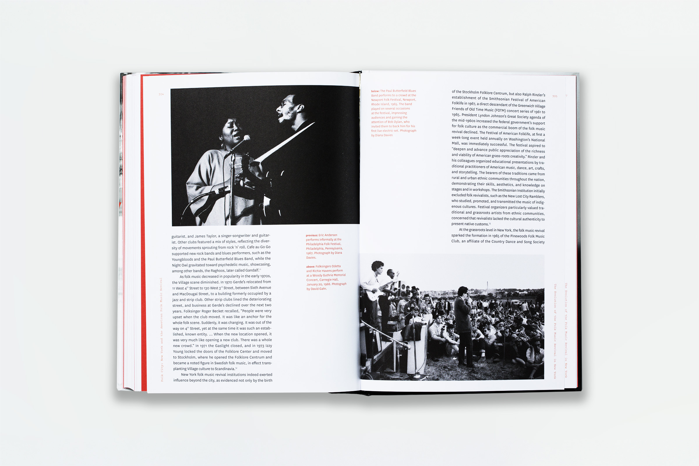
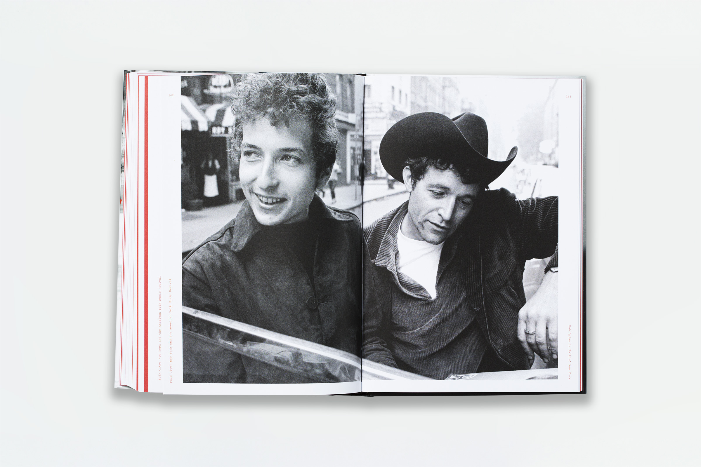
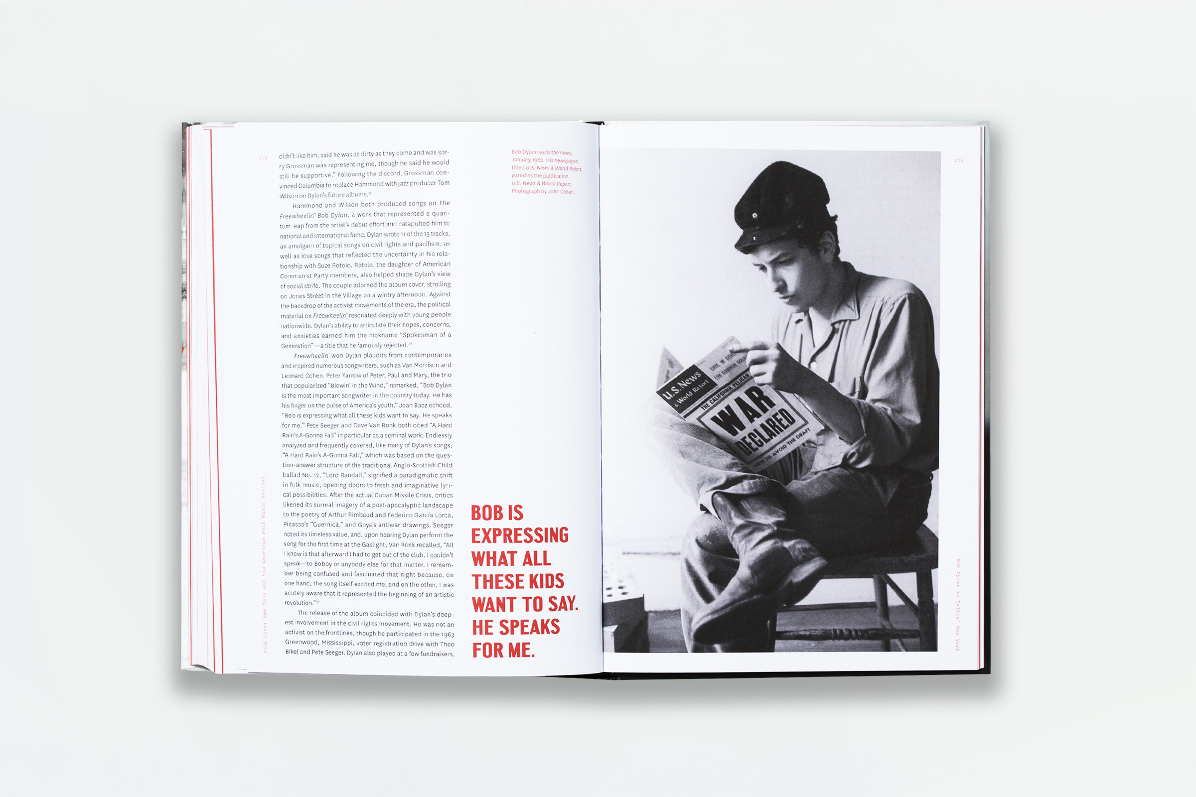
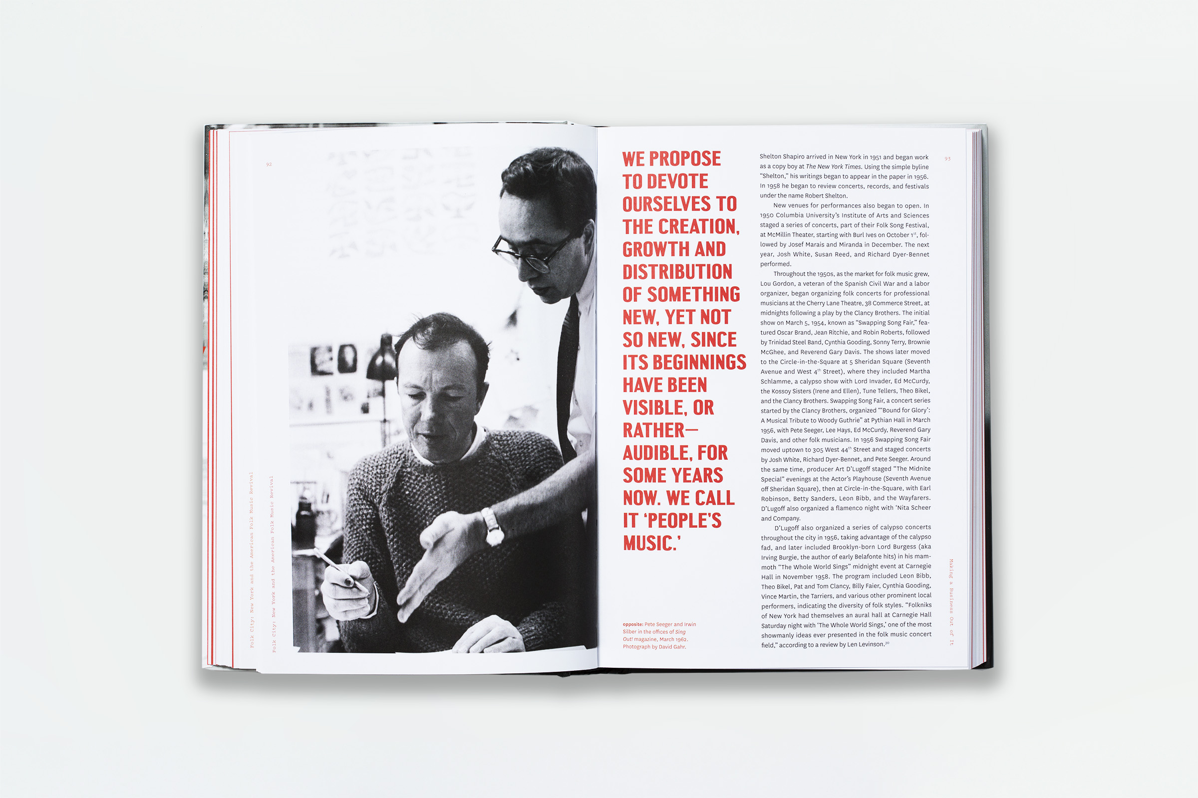
Pure+Applied designed and produced the exhibition reader Folk City: New York and the Folk Music Revival for Columbia University Press. Co-published by the Museum of the City of New York (where the exhibition itself was presented), the book was designed using images primarily from the museum’s collection. We selected the typeface “Central Avenue” for the display typography because of its hand-painted-like quality. We used the typeface “Pitch” to set the personal accounts of the people who lived during the Folk City Era. The design for the book set the graphic identity for the exhibition.
Pure+Applied designed and produced the exhibition reader Folk City: New York and the Folk Music Revival for Columbia University Press. Co-published by the Museum of the City of New York (where the exhibition itself was presented), the book was designed using images primarily from the museum’s collection. We selected the typeface “Central Avenue” for the display typography because of its hand-painted-like quality. We used the typeface “Pitch” to set the personal accounts of the people who lived during the Folk City Era. The design for the book set the graphic identity for the exhibition.
